Thursday, March 31, 2011

Samsung G400 Soul Disadvantages


Samsung G400 Soul review

All right then, Samsung and Soul know better than simply recasting a slider as a bar. Samsung G400 Soul is the one Soul family member that easily gets singled out. The clamshell phone pulls off near RAZR size and style (save for the thickness), and boasts the unique dual screen setup and a 5 megapixel autofocus camera. Actually, this is the first 5 MP clamshell ever, though for some reason Samsung chose not to pitch that in their promos. Anyway, the G400 is one heavy piece of skill and style. And even if it's the odd one in terms of looks, it seems set to live up to that Soul pedigree.

Key features:

  • 5 megapixel autofocus camera (face detection, wide dynamic range and image stabilization)
  • Identical external and internal screens: 2.2" 256K-color TFT LCD of QVGA resolution
  • Touch-sensitive external display with ,multimedia interface and haptics
  • 3G with HSDPA (7.2Mbps) support, video call
  • FM radio with RDS
  • 120MB of shared memory and microSD slot
  • Bluetooth (with A2DP) and USB v2.0
  • User-friendly keypad
  • Relatively fast user interface
  • Fully customizable themes
  • Dedicated settings for each of the displays
  • The main display doesn't get key prints in closed position

Main disadvantages:

  • Tri-band only
  • Only LED flash
  • Display legibility suffers under direct sunlight, external screen is hardly usable
  • Limited browser capabilities
  • QVGA video recording at most
Some may claim the G400 Soul design is too old school for a Samsung. OK, it's inconsistent with the Soul looks and quite akin to the well aged Moto RAZR concept. In fact the G400 has almost the same design as the Samsung Z560, which was set to compete with the Motorola RAZR V6 maxx.
Still, the G400 rounds off the form factor supply within the Soul lineup and tries to meet some demand for full-featured flips. But so much for vintage vs. vantage - even if 5MP and HSDPA are nothing radical these days, it takes a flip to show off that sweet dual screen combo. For one of the most intriguing specs is the huge (in clamshell terms) touchscreen external display.
Speaking of full-featured flips, Samsung G400 Soul easily comes out as the top dog in the pack. Even so, it's not immune to pressure and the handset to probably give it the strongest run for its money though is Sony Ericsson W980. It's a tough call between the Soul flip and the Walkman flagship. With enough class and gloss to go around, it all boils down to 5MP imaging or FM transmitter and auto screen rotation. Anyway, enough either-ors, take the jump for the real thing.

Samsung F700 Disadvantages


The F700 is pretty much where it all began for Samsung and large touchscreens. It was their first mobile phone to feature a three-and-above-inch touchscreen display while back in the day 3 megapixel autofocus cameras were still high-end stuff. As time went by Samsung F490 and the Samsung Armani phone loomed into prominence, and there are a few more coming up. And guess what, none of them has the bulky QWERTY underside. That should tell you something.
Anyway, we ended up reviewing the first full touch Samsung handset last among its kin. F700 packs the same touch user interface as the recently reviewed F490, but the old dog is clearly the underdog. Nevertheless, bear with us as we take on this slider for a ride.

Key features:

  • Stylish looks and high-quality build
  • Tri-band GSM and HSDPA support with video calls
  • Large 3.2" touchscreen TFT display of 240 x 440 pixel resolution
  • Comfortable QWERTY keyboard
  • 3 megapixel autofocus camera
  • Touch haptic feedback is present
  • microSD memory card slot
  • Stereo Bluetooth
  • Standard 3.5mm audio jack
  • Office documents viewer
  • Snappy user interface
  • Intuitive music player
  • Fast screen autorotation when keyboard is revealed

Main disadvantages:

  • Bulky size
  • Awkward and slow web browser scrolling and panning
  • Video recording maxes out at QVGA@15fps
  • Unable to play widescreen user-encoded WMV and H.263 videos
  • Slow image zooming in the gallery
  • The three Java games are trial versions only
  • The microSD slot is accessible only with the back panel off
What we have here is another handset, which gets defined through how it handles the load of being an iPhone look-alike. We don't mean to say that every touch-operated handset wants to be iPhone when it grows up. It's just sometimes the comparison forces itself even on the most neutral observer.
The quality construction and glossy finish can make you forgive the bulky size of Samsung F700, or sort of. The bodywork changes hues from violet through dark blue to black depending on how light falls on it. Once you have the Samsung F700 in your hand you can really tell it's an expensive high-end device. It didn't manage to win us over though. You can see why in the pages to come. Join us right after the jump.

Samsung F490 Disadvantages

Samsung F490 review

The Samsung F490 follows a trend that we welcome - touch-based user interface and a 5 megapixel autofocus camera. Add a widescreen 3.2" TFT display and a slim profile, and it already sounds like a juicy deal. We've already reviewed the Samsung Armani phone - that was based on the same Touch UI. However the Samsung F490 seems like the most mature Touch product of them all avoiding most of the mishaps of the previous products. So, buckle up as we test drive this baby in the GSMArena fast lane.
Samsung F490 resembles Samsung F700 but it lacks the hardware QWERTY keypad of its sibling. Just by looking at it, our guess is it's obviously aiming to put pressure on the LG Viewty, that is already available and gathering momentum. We'll see about that later on with an impromptu feature comparison.

Key features:

  • Stylish looks and high-quality build
  • Slim 11.8mm profile
  • Tri-band GSM and HSDPA network support with video calls
  • Large 3.3-inch touchscreen TFT display with 240 x 432 pixel resolution (16:9 screen ratio)
  • 5 megapixel autofocus camera
  • Vibrating haptic response
  • microSD memory card slot
  • Stereo Bluetooth
  • Standard 3.5mm audio jack
  • Office documents viewer
  • Snappy user interface
  • Intuitive music player

Main disadvantages:

  • Awkward and slow web browser scrolling and panning
  • Video recording maxes out at QVGA@15fps
  • Unable to play widescreen user-encoded WMV and H.263 videos
  • Slow image zooming in the gallery
  • The three fullscreen Java games are trial versions only
Just for the record, we won't be putting the "iPhone-killer" load on Samsung F490's shoulders. Never mind such a comparison seems to force itself into being every time a new full touchscreen handset gets released. The secret behind the iPhone success is not the "touchability" itself, but the fluid, almost physical reaction of the user interface to your fingers. That, along with the exceptional web browsing capabilities that no other portable device on the market is yet able to rival, makes it unique.
Still, while the iPhone has revolutionary user interface and web browsing, it's crippled in a "What were they thinking?" way in quite a number of other essentials. So just to sum up, the iPhone is a class in its own and it can't be challenged by any of the touch-enabled devices that we currently know of.
Anyway, while not exactly an "iPhone-killer", the Samsung F490 is a fascinating device, too. The glossy surface, the rounded edges, and the 11.8mm thin body - it's all there and it's all so inviting. Probably a future fashion-icon, the Samsung F490 looks like the crown piece of the Samsung lineup. We are yet to see about that, so catch up after this short jump.

Samsung F480 Disadvantages


To pick up where we left, prepare to meet the next bestseller by Samsung. If you think Samsung F480 is not up to such a challenge you might want to think again. The compact touch-operated handset has every chance of becoming the next best thing since sliced bread. It is extremely pocket-friendly but its own pocket is bulging - so to say - the little fella has it all. Plus, the looks are fantastic, so only one important question remains - is the performance on par with the marvelous specs. Luckily we are just about to answer that question, so sit back and enjoy.

Key features

  • Ample 2.8" 262K touchscreen color display of QVGA resolution
  • Touch-operated flash UI
  • 5 megapixel camera with autofocus and LED flash
  • Camera comes with face detection and wide dynamic range
  • 3G with HSDPA
  • Great design and high quality construction
  • 228MB of internal memory
  • microSD card slot
  • Widgets
  • Excellent haptics
  • FM radio with RDS
  • Great camera interface
  • EDGE, Bluetooth and USB connectivity
  • Great web browser

Main disadvantages

  • Tri-band only
  • Display legibility suffers under direct sunlight
  • No landscape mode and no virtual QWERTY keyboard
  • Fingerprint magnet
  • Inadequate flash for the camera
  • Video recording capabilities max out at QVGA resolution
The place on the market Samsung F480 is aiming at is far from vacant. There is a number of touch-operated Flash UI devices out there and, accidentally or not, most of them are made by Samsung.
The Armani phone is probably one of the bitterest rivals of Samsung F480. As we see it, the … well… designer handset has very little chance against the F480. The device we are currently reviewing is far more capable and its interface is well above the Armani. The difference in specs is also important. So much so that, if it wasn't for the haute couture engraving, the Armani phone would have been nothing more than the goofy sibling.
Samsung F490 is also taking part in this race but despite that its name suggests higher class than the F480, its functionality is not speaking of anything like that. The Croix interface may be an award winner, but is not nearly as nice to use as the flash UI of Samsung F480. Besides, the F480 definitely looks better and is more compact.
The LG KU990 Viewty is another similar handset in terms of functionality but of a significantly larger size. Still, it may seem as a good alternative for those who insist on good camera and video recording capabilities in their handsets.
So, crowded as it is in the touchscreen non-smartphone market, Samsung F480 seems to have good chances of success.

Samsung F110 Adidas Disadvantages

Samsung F110 Adidas review

Samsung F110 is not revolutionary. And no, it's not a high-end gadget either. But it's part of a unique workout system developed by Adidas. The Adidas miCoach system makes your phone a full-fledged workout sidekick recording each of your steps and guiding you along your sports endeavors while playing your favorite music to make sweating a bit more pleasant.
Beside that, Samsung F110 also sports a 2 megapixel camera, FM radio, stereo Bluetooth and 1GB of onboard memory - it's all there to make your personal sports coach that much useful in your everyday life when you are not on the track. You are more than welcome to join us as we take the Samsung 110 out for a jog.

Key features:

  • Dedicated sports features:
    • On-board miCoach application measuring sports progress and giving voice feedback
    • Synchronization with miCoach web-based coaching system
    • Built-in accelerometer with step counter
    • Stride sensor and heart rate sensor in the extended package
    • Comes with sports headset, 3.5mm audio jack remote and an armband
  • 2 megapixel camera
  • 1GB of onboard storage
  • FM radio
  • Stereo Bluetooth
  • Works without a SIM card inserted

Main disadvantages:

  • Boring design
  • Camera has no autofocus
  • Poor display resolution and poor sunlight legibility
  • Built-in step counter is really inaccurate
  • No memory card slot
  • No 3G
  • No office documents viewer
Adidas is not new to computer-based running. Back in the mid-1980s they were making headlines with their Micropacer running shoes. There was a built-in microprocessor in the tongue of one shoe, linked to a sensor in the sole. The runner needed to input the length of their stride and some other data, which helped the microprocessor calculate distance, average speed and calories burned. A LED on the tongue of the shoe displayed all the data plus elapsed time. The Micropacer running shoes were being sold for around $100, which back then was a preposterous sum to spend on trainers.
Archrivals Puma had their own geeky running shoes too. For about $200 you would get the Puma RS Computer running shoes along with an Apple II personal computer, a connecting cable and some software to record and analyze all the data for you and present it graphically.
Back to modern day, a popular digital training system is the Nike +. It includes Nike+ ready shoes, Nike+ iPod Sport Kit and an iPod nano. You put the wireless sensor in the sole of your Nike+ shoe and you plug the wireless receiver with your iPod nano. And off you go running and listening to music and live feedback with your running stats. Once you are done, you sync your iPod nano with the Nike+ server and you can see how you did. Plus, you can see how you stack up against all those other runners in the Nike+ community.
The Adidas miCoach system is rather similar, but with a few enhancements. You don't need special Adidas shoes, the stride sensor is easy to fit on the laces of every running shoe on the market. Next, you have a heart rate monitor, something that the Nike+ system lacks. Both the stride sensor and the HRM sensor transmit the data to the Adidas miCoach phone wirelessly. And finally, the last part of the miCoach system is the Samsung F110 mobile phone. It doubles as a music player and it also gives real-time feedback on your running stats. Once you get home, you simply sync it with the miCoach website and see how you did. You can also load a new workout tailored specifically to your profile.
Speaking of the Samsung F110 mobile phone, it obviously will be the focus of our review. After all, mobile phones are our line of business. But for your reading pleasure, we will be covering the miCoach system too. So sit back and pop your slippers on, but keep them trainers at hand, ready for some digital jogging across the pages to come right after this short jump.

Samsung D880 Duos Disadvantages

Samsung D880 Duos review

Armed with solid design and the Samsung quality of build, the Samsung D880 Duos is two phones in one . It offers seamless dual SIM functionality with almost no compromise. Backed by a 3 megapixel autofocus camera and a large 2.3" QVGA TFT display, the Samsung D880 Duos is an intriguing package, truly worth closer examination. So, hop on as we head to explore the dual nature of Samsung Duos.

Key features:

  • Seamless dual SIM functionality (both cards are active simultaneously)
  • 3 megapixel autofocus camera with good image quality
  • 2.3" 262K-color TFT display (QVGA resolution)
  • microSD memory card slot
  • FM radio
  • Bluetooth with A2DP
  • TV out
  • MS Office document viewer
  • Quick interface response
  • Large capacity battery
  • Comfortable keyboard and controls

Main disadvantages:

  • Secondary SIM can be used for telephony and messaging only
  • Secondary SIM has dual-band support only (no 1900 MHz support)
  • Large size
  • Boring slider design
  • Interface options well behind the times
  • Poor sunlight legibility
  • No 3G support
  • Portrait-oriented camera
  • Poor web browser
  • Awkward file browser
  • Poor music player
Using two SIM cards in one phone is increasingly becoming an option many are willing to consider. Using both a personal and a business number with one single handset, saving some money by combining two different plans or network carriers, or regularly using local prepaid cards on business trips - to name just a few reasons why one should be interested in a dual-SIM mobile.
The initial high price tag of Samsung D880 Duos seemed rather unjustified. It really manages to replace two handsets, but it didn't seem fair for it to cost well over their combined price. Now that the price tag is more acceptable, we look at the possibilities it offers people who often carry - and are forced to use - two or more handsets.
The Samsung D880 Duos is not the first dual SIM handset on the market. Various Chinese manufacturers have been working hard in that traditionally unexplored area. We even did an article on various dual SIM solutions back in August last year to help you get started with the various options.
In the mean time, major mobile phone manufacturers seemed disinterested or were simply trying to avoid potential pressure from the telecoms, which are their main clients after all.
Samsung were first among the majors to announce a dual SIM handset in October 2007 - the D880 Duos. Rather recently Samsung announced the next of kin - Samsung D780 and are planning to expand the lineup even further in 2008.
We will talk more about the dual SIM functionality in the dedicated chapter of our review. If we've got you interested by now, hit the jump for our detailed review of Samsung D880

Samsung D780 Disadvantages


Samsung are obviously not of two minds about two-in-one phones. A new dual SIM handset - the Samsung D780 - is underway and it's intended as a more affordable dual SIM solution as compared to the D880 Duos. On the outside, there's nothing cool about Samsung D780 and that's fine by us. The new dual SIM bar means business and its top skill is well tucked under the battery. What you get is quality of build, comfy large keyboard and friendly handling. A big fella by all means, the D780 is a sensible piece of dual SIM action.

Key features:

  • Seamless dual SIM handling (both cards are active simultaneously)
  • 2 megapixel camera with nice image quality
  • 2.1" 262K-color TFT display (QVGA resolution)
  • microSD memory expansion
  • FM radio
  • Bluetooth with A2DP
  • MS Office document viewer
  • Snappy user interface
  • Comfortable keyboard and controls

Main disadvantages:

  • Secondary SIM good for telephony and messaging only
  • Secondary SIM dual-band only (no 1900 MHz support)
  • Large size
  • Interface options well behind the times
  • Poor sunlight legibility
  • No 3G support
  • Portrait-oriented camera
  • Poor web browser
  • Awkward file browser
  • Poor music player
Using two SIM cards in one phone is increasingly an option many are willing to consider. No wonder then, one of the top cell phone makers are reaffirming their commitment to address this kind of demand. Samsung were first among the majors to announce a dual SIM handset in October 2007 - the Samsung D880 Duos, which we reviewed recently.
Well before the D780 and D880 Duos, various Chinese manufacturers have been busy exploring the uncharted territory of dual SIM. We even did an overview of dual SIM solutions back in August last year to help you stay on top of the various options. Philips and WND are among the more popular companies trying to get a piece of the action, while most of the top dogs seem disinterested or are simply trying to avoid potential pressure from the telecoms.
Samsung D780 should get a more reasonable price tag than the D880 Duos, which has a rather unjustified initial asking price. After all, the D780 is pitched as a more affordable alternative to D880 Duos. A competitive price tag on D780 will help Samsung set a firm foot in the dual SIM niche.
Anyway, enough sidestepping - hit the jump for more Samsung D780.

Samsung B7300 OmniaLITE Disadvantages


Introduction
It's business as usual on the WinMo front and all the action seems to be around the upper end of the pricing scale. Impressive as those top PocketPCs may be, they are hardly the stuff that makes the sales meters tick and bring the profits that fuel the R&D machine.

Samsung B7300 OmniaLITE is one of the very few that dare to try and bring Windows Mobile to the masses. Budget PocketPCs are not unheard of but what makes OmniaLITE different is WinMo 6.5. The compact full-touch handset has the essentials perfectly covered, and sprinkled with a few nice extras too. But most importantly, the price tag won't make you wince.
Key features
  • 3" 65K-color resistive touchscreen of WQVGA resolution
  • Quad-band GSM support
  • 3G with 3.6 Mbps HSDPA
  • Windows Mobile 6.5 Professional OS with TouchWiz UI
  • Samsung ARM 1176 667MHz CPU and 256 MB of RAM
  • 3 megapixel autofocus camera with smile detection and VGA@15fps video
  • Built-in GPS receiver with A-GPS
  • Wi-Fi with DLNA
  • FM radio with RDS
  • DivX and XviD video support right out of the box
  • Stereo Bluetooth 2.1, standard microUSB port
  • Office document viewer and editor
  • Excellent response and performance
  • Above average audio quality
Main disadvantages
  • Low-end display resolution
  • No standard 3.5mm audio jack
  • Poor screen sunlight legibility
  • No two-position shutter key, despite autofocus functionality
  • No stylus slot
Most of them Samsung B7300 OmniaLITE specs are quite a good match for the original Omnia. There are some differences of course but in the eyes of the potential buyers they just can't be make or break we think. And besides it's a pretty fair trade-off considering the asking price.
The doubled RAM and standard microUSB port come at the price of a smaller screen and a downgraded camera. But those differences are not really enough to pull the two devices that far apart.
We guess the LITE version looks quite a bargain - at least on paper. But don't think Samsung have suddenly become charitable. The thing is the original Omnia has produced an impressive offspring. And the strong lineup is so segmented and the market so evolved that users can enjoy a high-end feature set at a midrange price. But the important question is will the B7300 OmniaLITE survive in the shadow of its near-iconic sibling that easily tops our all-time popularity ranking of Samsung handsets.
As usual when such questions arise, we try to provide the answers. For starters, we'll check if the build quality and ergonomics of the B7300 are up to the high standards of its elder brother. So, hop on to the next page where we kick it off nicely.

Samsung B5310 CorbyPRO Disadvantages

Introduction

The S3650 Corby was just the beginning of a lineup that appears to have no visible end. There is a Corby for the touchscreen addicts, a Corby for the music buffs, Corby for the heavy texters, Corby for the young, and one for their parents. That’s pretty much everyone, don’t you think? We guess there should even be a Corby for the bored-with-the-Corby.
The founding member of the Corby wasn’t announced so long ago, but so much has been changed. Well, if you put the S3650 Corby and the recently announced B5310 CorbyPRO side by side you'll notice one thing that hasn't changed at all: design. But on the inside they are very different, indeed.
The Samsung CorbyPRO is meant for a different range of users altogether. It combines great texting and the intuitive touchscreen control tops that up with a nice connectivity package (such as HSDPA, Wi-Fi, GPS and a 3.5mm audio jack) and all that is delivered at a bargain price.
Key features
  • Quad-band GSM/EDGE
  • Dual-band UMTS support with HSDPA
  • 2.8" resistive TFT touchscreen of QVGA resolution
  • Four-row side-slide QWERTY keyboard
  • 150 MB onboard storage, microSD card slot (up to 16GB)
  • 3.15 megapixel fixed-focus camera with smile detection, QVGA video @ 15fps
  • FM radio with RDS
  • Find Music recognition service
  • TouchWiz and Cartoon UI
  • Social networking integration with direct file uploads
  • GPS with A-GPS support
  • Wi-Fi and GPS
  • 3.5mm audio jack
  • Accelerometer sensor for screen auto rotation
  • Office document viewer
  • Excellent web browser
  • Push email
  • Smart unlock
  • Replaceable rear covers (Fashion Jackets)
Main disadvantages
  • Disappointing sunlight legibility
  • The camera has no autofocus or flash
  • Video recording maxes out at QVGA@15fps
  • All preinstalled games are trial versions only
  • Google Maps is the only GPS navigation app
  • microSD slot is under the battery cover
The original Corby was all about design, about touchscreen, about budget. The CorbyPRO, on the other hand, has managed to keep all that but goes much further by adding some killer features that are well above the S3650 league.
For instance, now you get UMTS support with HSDPA which will dramatically boost web browsing. But the really big news here is Wi-Fi support. It is a great addition to the comfy QWERTY keyboard and the numerous social networking services that the phone gives you access to.

Samsung Armani Disadvantages

Samsung Armani review

f there's one thing the Samsung Armani phone has in abundance, it most definitely is style. Slim, compact and high-tech, the fully touch-operated Armani phone is not just the final touch to your look - it's the finish with a flourish. Anyway, with us the tech junky tends to get the upper hand over the fashion savvy, and we are eager to find out if there's more to it than what meets the eye. The really promising Samsung Armani phone seems the right mix between technology and looks, but we're more interested in how it fares as a gadget, not an accessory.

Key features:

  • Stylish looks and high-quality build
  • Small dimensions and compact "card" form factor
  • 2.6" touchscreen TFT display with QVGA resolution
  • Vibrating haptic response
  • microSD memory card slot
  • Stereo Bluetooth
  • 3 megapixel camera
  • Office documents viewer
  • Rich retail accessories

Main disadvantages:

  • Slow interface response
  • Slow memory card reading
  • Awkward web browser controls
  • No 3G support
  • No camera auto focus
The model designation that hides behind the Samsung Armani name is actually Samsung P520. That alone may be enough of a hint that the Armani phone is an offshoot of the Samsung P-series. The Samsung Armani has inherited the same form factor and has the same size and weight as the Samsung P310 for example.
The Samsung Armani phone comes in two retail packages - standard and extended . The difference between the two is the Bluetooth headset in the bigger one.
The standard contents of the retail box are a hard leather case, charger, data cable, memory card, a wired stereo headset, soft pouch as an alternative to the leather case and, finally, a cleaning cloth.
All the contents of the box look really classy and are all Giorgio Armani branded. The user guide has the most exquisite covers we've seen, for example.

So after you've had a taste of what's coming, you are welcome to hop aboard and stay with our Samsung Armani phone review right after the jump.

Nokia X6 Disadvantages

Introduction

In the world of Nokia it's all about evolution, rather than revolution. So don't expect the specs on the X6 to blow your mind. The handset is the next step for the market leader scrambling to make up for a late start in touch- screens. To be honest, the Symbian S60 touch edition has been struggling to catch up with the standard setters in terms of user experience. And the X6 claims to have the answer: the responsiveness only a capacitive screen can bring.

Nokia X6 official photos
The Nokia X6 is also the first XpressMusic handset to head straight for the high-end. Midrange is the highest the music Finns have gone so we are interested to see how this change of approach works. Nokia have always had a strong appeal to the masses, but pleasing the selected few is undoubtedly harder.
Key features:
  • Quad-band GSM support
  • Tri-band 3G with HSDPA support
  • 3.2" 16M-color TFT LCD 16:9 capacitive touchscreen (360 x 640 pixels)
  • Symbian S60 5th edition UI
  • ARM 11 434 MHz CPU, 128 MB of RAM memory
  • 5 megapixel autofocus camera with dual-LED flash
  • VGA video recording at 30fps
  • Wi-Fi 802.11 b/g, UPnP technology
  • Built-in GPS receiver
  • 32GB built-in storage
  • FM radio with RDS
  • Bluetooth and USB (standard microUSB connector) v2.0
  • 3.5mm standard audio jack
  • Very good audio quality
  • Proximity sensor for screen auto turn-off
  • Accelerometer sensor for automatic UI rotation and motion-based gaming
  • Stereo speakers
  • TV out
  • "Comes with music" edition gives you a year of all-you-can-eat music subscription
  • Landscape on-screen virtual QWERTY keyboard
  • Ovi Maps 3.0 Touch
  • Further Ovi and MySpace service integration (direct image and video uploads)
  • Most regional retail packages include a set of the great Nokia WH-500 headphones
Main disadvantages:
  • X6 is still quite pricey (around 500 euro at the time of writing)
  • UI is still immature with somewhat inconsistent user experience
  • Touch web browser not quite polished and with dodgy Flash support
  • No voice-guided navigation license
  • No office document viewer preinstalled
  • Doesn't charge off microUSB
  • Very poor sunlight legibility
  • Slow image gallery
  • No DivX/XviD support for the video player
  • No microSD card slot (as a connectivity solution)
As you can see in the two lists above there is almost nothing new in the software package, so it all falls on the hardware to justify the high asking price. The well-stuffed retail package is a great place to start but does the capacitive screen improve usability enough to be worth the extra money over, say, the 5800 XpressMusic? And the difference in price is by no means trivial.
Nokia X6 at ours
In the increasingly competitive touchscreen market manufacturers don't have much room for error. The unpolished S60 UI is enough of a burden already, so Nokia X6 has to be near perfect in every other respect. A tall task indeed, but let's see how they've tackled it.

Nokia X3 Disadvantages


Introduction
The Nokia X3 is our first glimpse into the new Xseries and we’re excited to see how things have changed since XpressMusic ran the show. And they have changed, the new angular look is a testament to that. The S40 on the inside has changed as well, throwing Ovi Store and basic multi-tasking into the mix.


Currently the Xseries is composed of two completely different phones. The Nokia X6 is a touch phone running Symbian, and the X3 is an affordable Series 40 slider. It packs stereo speakers, excellent audio quality and a built-in FM radio antenna for a complete sonic experience. All right, we said affordable, so don’t go looking for top-notch gear beside the obvious full music package.

Nokia X3 introduces us to the Xseries
The Nokia X3 runs the Series 40 6th edition but it’s unlike any S40 handset we’ve seen before. For a brief, joyful moment, we thought Nokia have finally given in and added multitasking. The truth turned out to be different but still there were small steps taken in the right direction. And you should see what they’ve done with the Gallery – it’s only a notch bellow the S60 one.
But let’s not get ahead of ourselves and let’s take a look at the Nokia X3 pros and cons.
Key features
  • Quad-band GSM/GPRS/EDGE support
  • 2.2" 262K color QVGA display
  • 3.2 megapixel fixed focus camera
  • S40 user interface, 6th edition; rudimentary multitasking
  • Stereo FM radio with RDS; Built-in antena (so it plays on the loudspeakers even if you don’t plug the headset)
  • Stereo speakers
  • Standard 3.5mm audio jack
  • Up to 26 hours of music playback
  • Bluetooth (with A2DP) and microUSB port
  • microSD card slot (16 GB supported, 2GB included)
  • Rich preinstalled application package
  • Ovi Store, Ovi Maps and Ovi Share
Main disadvantages:
  • No 3G connectivity
  • Smallish display with poor viewing angles and sunlight legibility
  • Slider action has an unpleasant plastic-on-plastic friction
  • No accelerometer for screen auto rotation
  • S40 interface feels clunky and out of date
  • No true multitasking
  • No smart dialing or an office document viewer
  • A bunch of software bugs
  • Video recording maxes out at QCIF@15fps
The specs look like nothing to be excited about but a shortish feature list never tells the whole story. So, think before you go “Nah, it sounds lame”, because you’ll be wrong about sound. We spent several days with it and now we’re ready to tell you the story behind those specs, the good, the bad and the ugly, the whole thing.
Do we have your interest? Good. Jump to the next page where we open the box and take a look at the Nokia X3. After the hardware inspection we’ll try to explain what the deal is with this multitasking-but-not-quite situation.

Nokia N900 Disadvantages


Introduction
It's crystal clear by now that the Nokia N900 has almost nothing to do with the traditional Nseries values. The full QWERTY side-slider may look similar to its double-digit mates but the Maemo experience is completely different. However, the N900 is not there for the mere sake of difference - a tablet and a phone, it tries to get
The internet tablet genes are strong in the Nokia N900 so connectivity and web-browsing are its greatest virtues. The large high-res display and great typing skills are the right kind of backup but we've seen plenty of similar packages already. We told you though - the N900 is different. It's a Maemo-powered phone with Mozilla browsing and all-you-can-eat connectivity. Call it good news, call it a good start or just call it good. Let's see if it calls back.
Key features
  • 3.5" 65K-color resistive touchscreen of WVGA (800 x 480 pixel) resolution
  • Maemo 5 OS
  • State-of-the-art Mozilla-based web browser with Adobe Flash 9.4 support
  • Slide-out three-row full QWERTY keyboard
  • ARM Cortex A8 600MHz CPU, PowerVR SGX graphics accelerator; 256 MB of RAM
  • Quad-band GSM and tri-band 3G support
  • 5 MP autofocus camera with dual-LED flash and active camera lens cover
  • WVGA (848 x 480 pixels) video recording @ 24fps
  • 10 Mbps HSDPA and 2 Mbps HSUPA support
  • Wi-Fi and GPS with A-GPS
  • 32GB onboard storage
  • DivX and XviD video playback
  • Foldable kickstand
  • microSD card slot with microSDHC support
  • Built-in accelerometer
  • Proximity sensor
  • 3.5 mm audio jack and TV-out
  • FM Radio receiver, FM transmitter
  • microUSB port (charging) and stereo Bluetooth v2.1
  • Solid audio quality
  • Kinetic scrolling
  • Contacts integration of Skype, Google Talk and other VoIP services
  • Great build quality
Main disadvantages

  • Large and heavy
  • UI only works in landscape mode (for now)
  • No video call capabilities, smart and voice dialing
  • Outdated camera interface and features
  • No preinstalled voice-guided SatNav application
  • No voice recorder, no MMS, and no handwriting recognition
  • No FM radio application (despite that the hardware's there)
  • Limited third-party software availabilty
  • Limited 3G support in the US (no AT&T)
In our preview we saw the Nokia N900 as a lean and mean browsing machine. This price range though has little to no room for one-trick ponies. The chubby phone/tablet will have to play its best and that's where Nseries come in. Of course, the Maemo has still to catch up with Symbian in terms of system expandability but the N900 is an Nseries handset and all-round service is implied.
One thing to definitely note about the Nokia N900 is the WVGA screen, which is not too frequent to see in other smartphones - platform limitations are hard to get around. There is of course the Vodafone 360 H1produced by Samsung and running LiMo, which even adds 16M-colors support, but it's very much a niche device. Now add the QWERTY keyboard, which turned out pretty comfortable despite the three-row layout, and things are starting to get there.
So, it's time we checked what the Nokia N900 can do for you and where it can possibly fail. A new OS (new to phones anyway) should be able to at least come close to the current crop of smartphone platforms and show a high enough development potential. For what we saw in our preview, the Maemo and the N900 may as well be even more ambitious. But if you take nothing for granted you've come to the right place. Join us on the next page as we power up the N900 and the review unfolds.

Nokia N97 Disadvantages

Nokia N97 review

They don't get any bigger than that. A launch of this caliber can aptly be called inauguration day. The release of Nokia N97 is the Nseries counter-move that geeks have been waiting for since November. Easily one of the most complete smartphones ever created, the N97 has been haunting Symbian buffs' dreams for quite a while.
We're about to see if this feature-loaded son of a gun is the stuff dreams are made of and if it has the gut to stand up to the best on the market. The 5800 XpressMusic was cheap enough to easily be forgiven a couple of shortcomings but the N97 is not the begging type. Nokia-faithfuls are used to only getting the best treatment, so they won't settle for less with the Nseries skipper.

Key features

  • Slide-n-tilt 3.5" 16M-color resistive touchscreen of 640 x 360 pixel resolution
  • 5 megapixel autofocus camera with dual-LED flash and lens cover (VGA@30fps video recording)
  • Symbian OS 9.4 with S60 5th edition UI
  • Slide-out three-row full QWERTY keyboard
  • ARM 11 434MHz CPU and 128 MB of RAM
  • Quad-band GSM support and 3G with HSDPA support
  • Wi-Fi and GPS with A-GPS (plus 3 months of free voice-guided navigation via Ovi Maps)
  • Digital compass
  • Class-leading 32GB onboard storage
  • microSD card slot with microSDHC support
  • Built-in accelerometer
  • 3.5 mm audio jack
  • TV out
  • Stereo FM Radio with RDS, FM transmitter
  • microUSB port and stereo Bluetooth v2.0
  • Web browser has full Flash and Java support
  • Nice audio reproduction quality

Main disadvantages

  • The S60 5th edition UI still has poor ergonomics and is not as thumbable as expected
  • Camera features are so two-thousand-and-late
  • No DivX or XviD support out-of-the-box
  • No smart dialing
  • Somewhat limited 3rd party software availability
  • No office document editing (without a paid upgrade)
Obvious from the list above, the Nokia N97 hardly puts anything new on the table. It is however a bold try to fit all of today's top features under one hood and offer a nice ride at that. This certainly is an ambitious task by itself but the ever-expectant Nseries fans, who always want something new on their next handset, make it even harder. The Nokia N97 will need to be near flawless to get a warm welcome.
Nokia N97 will also be a major test for the still quite young (or immature if you want) S60 5th edition UI. The growing pains were expected and acceptable in the 5800 XpressMusic, but it's been 8 months since. The time is long enough in mobile phone terms and the market leader is simply expected to have had everything figured by now.
The disappointing N96 does owe Nokia some and the N97 will - among other things - probably have to cover its debts too. Join us on the next page as we take a peek inside the retail box of the new Nseries sovereign and complete our ergonomics rundown.

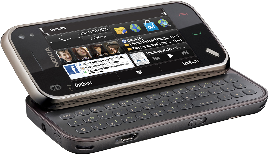
Nokia N97 mini Disadvantages


Introduction
The Nokia army of touchscreen smartphones gets larger by the hour and the Nokia N97 mini is surely one of the most interesting new recruits. The Finnish company has obviously reconsidered its priories and now focuses on optimization, rather than expansion with its flagships.
The original Nokia N97 was the first sign of that as it hardly offered any ground-breaking features, instead relaying on the good all-round performance. However the first high-end S60 touchscreen handset left enough room for another similar handset in the portfolio and Nokia feel that its downsized version is enough to fill the gap.
Key features
  • Slide-n-tilt 3.2" 16M-color resistive touchscreen of 640 x 360 pixel resolution
  • 5 megapixel autofocus camera with dual-LED flash and VGA@30fps video recording
  • Symbian OS 9.4 with S60 5th edition UI with kinetic scrolling
  • Slide-out three-row full QWERTY keyboard
  • ARM 11 434MHz CPU and 128 MB of RAM
  • Quad-band GSM and tri-band 3G with 3.6Mbps HSDPA support
  • Wi-Fi and GPS with A-GPS
  • Digital compass
  • 8GB onboard storage
  • microSD card slot with microSDHC support
  • Built-in accelerometer
  • 3.5 mm audio jack and TV-out
  • Stereo FM Radio with RDS
  • microUSB port (charging) and stereo Bluetooth v2.0
  • Web browser has full Flash and Java support
  • Nice audio reproduction quality
  • Office document viewer
Main disadvantages
  • The S60 touch UI is still inconsistent
  • Outdated camera interface and features
  • No DivX or XviD video support out-of-the-box
  • No smart dialing
  • No office document editing (without a paid upgrade)
  • No camera lens protection
  • No FM transmitter (though that may be stretching it too far)
Nokia N97 mini vs Nokia N97
  • More compact (113 x 52.5 x 14.2 mm, 75 cc vs 117.2 x 55.3 x 15.9 mm, 88 cc)
  • Lighter (138g vs 150g)
  • Smaller display (3.2" vs 3.5")
  • Less internal memory (8GB vs 32GB)
  • Smaller battery (1200 mAh vs 1500 mAh)
  • No lens cover
  • No FM transmitter
  • Arrow keys vs D-pad
The N97 mini has quite a task on its hands, constantly being compared to the moe high ranking Nokia N97 even though it comes later to the market. As usually happens in such cases, the price difference that would have been present if both handsets were launched simultaneously is reduced and the balance of powers has shifted.
Still the reduced display (and mostly body size) is a welcome change for many users, who used to find the Nokia N97 intolerably bulky. We certainly hope it's got a few tricks up its sleeves so it can put up the original N97 a good fight and differentiate enough beyond size and pricing. Well, we're about to check that and much more in one of our trademark reviews, starting with the unboxing on the next page.